Map 1:

Map 2:

Map 2:

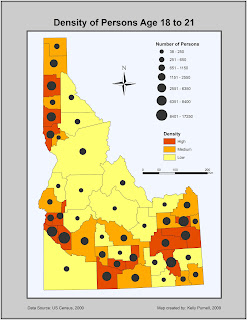
Map II: Bivariate Map
The purpose of this map was to portray the population density of persons age 18 to 21. This was done by selecting both the attribute Age 18-21 and Density_gp. Density_gp was a background choropleth map depicting whether the density of this age group was high, medium, or low within Idaho counties. The attribute Age 18-21 is raw data. This was mapped using proportional symbols to portray the total number of this age group in each Idaho county. This kind of map is fairly easy to interpret with the proper legend and a well chosen color scheme. The map reader should be able to evaluate which counties have the highest population density of the chosen age group with ease. The color scheme of the choropleth map was chosen for lightness as well as change in hue so that counties with the highest value showed up in red (dark and warm), medium values showed up in orange (medium hue), and low lowest values were light yellow (warm and muted). This was chosen for qualitative purposes as it is easy to extract the information of the map.
There were several difficulties in this bivariate mapping exercise. Choosing the data classification method of the raw data was not the easiest task. The classification needed to be show the greatest differentiation in symbol size for the proportional symbology. I ended up choosing seven classes using the Natural Breaks method as this seemed to best capture the variation in quantities of the population age 18 to 21.
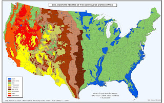
Map of the Week: USDA Soils Map
This map is the USDA soils map. The point of the map is to portray where the most drought occurs. As a thematic map, this is well done and accurately and effectively portrays the information and purpose.


Map of the Week: Elevation map of Salem, OR
I chose this map because I wanted to show a relatively bad example of a raster elevation map. The map is of the city of Salem, Oregon and is meant to represent elevation values as well as city features. However, at first glance one might think this is a map of ocean depths. The qualitative value of the map is poorly done. Shades of blue were not a great choice to protray elevation, especially considering that Salem is not near the coast. I thought this was a good example of what not to do when creating an elevation map.

source: http://www.cityofsalem.net/Departments/InformationTechnology/GIS/Pages/ElevationMaps.aspx


Map of the Week: I chose this map because I thought it was an interesting example of thematic mapping. The map is a 3-D representation of population change in Canada by province. Its both qualitative and quantitative. its well balanced with good use of color and map element placement. Source: geodepot.statcan.ca

 e was in Buffalo, New York. The data represented in this map is nominal. This is just to show where where the majority of each selected race is present. The map is effective in showing the spatial location of the data. In this map I changed some of the map elements. I added a neatline and a frameline and made the outside grey to better highlight the map. I put a frame arund the legend as well to help distinguish it from the map but without drawing too much attention. I left the colors the same as they adequately portray the data without being too eye jarring. I made the map figure itself larger to eliminate more white space.
 otibly the color scheme. The previous color scheme was too abrasive and may be better suited for a qualitative map. There is some gradation in the redesigned map and better represents numerical data. I put in a frameline and neatline, changed the title to better represent the map and reduced the title on the legend. These make for better contrast and understanding of the data represented.
 Nez Perce Map:
 Line Simplification Map:


 Lab 3 Redesign:
