Lab 2 Redesign:
Freehand Map:
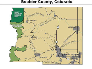
The freehand map got us acquainted with the program. It is basically a reference map of Boulder County, Colorado. This isn’t the easiest program to use but it has some neat features. I idid change a bit for better clarity of the map features. I lightened the shade of grey that I used to represent the cities and used a drop shadow to make them stand out. I used an inner glow feature for the parks, also to make them stand out more against the majority of the county background. I changed the background color so that the colors weren’t so jarring and put a neatline around the map. Other than that, I didn’t
change much. I liked the text placement so
I didn’t’ mess with it too much.


Kinda neat.
ReplyDeleteI like some of the designing, but it doesn’t seem to all match each other. Maybe add shadows to city labels, and reduce the shadow length on city borders and reduce the size of the glow (are the parks the focus of the map?)
Perhaps a more subdued green for the N.P.
Move (and shrink?) the Indian Peaks label so that it is contained in the park.
I like the labeling on the peak to peak highway. Good job.
I also somewhat like that drop shadow on the title.
Maybe lighten the main tan background.
Maybe re-organize the city labels in the bottom right down by Boulder.
Ya know, some map opinions are just that – opinions.