The purpose of the map is to portray the composition of races in Idaho counties excluding the white population. The pie charts unique to each county exhibit what races exist by proportion of the whole. This kind of map is easy to interpret as long as the legend is clearly labeled.
Pie chart maps are very user friendly and map readers should be able to extract the information portrayed with little difficulty. However, there are several limitations to this kind of mapping. When the variable chart size option is selected the user cannot manually set the max size of the pie charts. This can cause several problems: the minimum chart size must be set to where the user can read it, but if it gets too large the maximum sized charts become crowded and the map looks cluttered and unorganized. Color schemes are also difficult to choose to where the largest proportions of the pie charts do not have a color that is too overwhelming. It is much easier to manually choose the colors to best portray the information. I chose lighter shades of colors for the most dominant proportions and bright colors for the smallest so that they could be seen in contrast. This seemed to solve the problem.

Map II: Bivariate Map
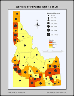
The purpose of this map was to portray the population density of persons age 18 to 21. This was done by selecting both the attribute Age 18-21 and Density_gp. Density_gp was a background choropleth map depicting whether the density of this age group was high, medium, or low within Idaho counties. The attribute Age 18-21 is raw data. This was mapped using proportional symbols to portray the total number of this age group in each Idaho county. This kind of map is fairly easy to interpret with the proper legend and a well chosen color scheme. The map reader should be able to evaluate which counties have the highest population density of the chosen age group with ease. The color scheme of the choropleth map was chosen for lightness as well as change in hue so that counties with the highest value showed up in red (dark and warm), medium values showed up in orange (medium hue), and low lowest values were light yellow (warm and muted). This was chosen for qualitative purposes as it is easy to extract the information of the map.
There were several difficulties in this bivariate mapping exercise. Choosing the data classification method of the raw data was not the easiest task. The classification needed to be show the greatest differentiation in symbol size for the proportional symbology. I ended up choosing seven classes using the Natural Breaks method as this seemed to best capture the variation in quantities of the population age 18 to 21.
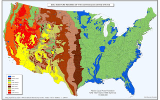
Map of the Week: USDA Soils Map
This map is the USDA soils map. The point of the map is to portray where the most drought occurs. As a thematic map, this is well done and accurately and effectively portrays the information and purpose.

No comments:
Post a Comment