 Lab 3 Redesign:
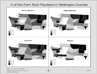
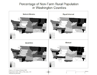
This map represents four different types of data classification. I chose to use the percentage of non-farm rural population in counties of the state of Washington. Each map shows the data differently. The purpose is to find which one best represents the data. Despite reprojecting the maps several times, my scale bar never worked correctly. Even when I went back to redesign a little bit. However, I did put a frameline to better contain the map elements and to eliminate too much white space. I made the legends for each map slightly large to maximise use of white space and condensed the map title slightly to take less attention off of it and to put more focus on the actual map features.


Kelly, you probably already know some of this stuff and it might do much good for me to tell you, but oh well.
ReplyDeleteIn the corrected map:
I think % at the beginning of the title really should be a word, like before.
Legend text could be enlarged to make numbers more legible. Next time you might want to consider a horizontal color ramp, takes up less vertical space and would allow more zoom on the mapped area. It can be done without converting to a graphic legend. Let me know and I’ll show ya
Projection need only say “NAD 83. UTM 11N” to properly define. I would suggest added the cartographers name and at least the year of map creation (2009). Might want to make the text smaller – should it be larger than legend texts?
I like The grey background surrounding. I also like some of the element balance to the bottom area.